It’s imperative for any and every website to know how to deliver an outstanding user experience. Oftentimes, a good user experience can be the key differentiator between a high-performing website versus a low-performing one.
According to a study, every $1 you invest in UX can bring your return up to $100. That’s an ROI of 9,900%! But other than the ROI, Good UX is just a sound idea. After all, you want your visitors to like visiting your website and never the opposite, right?
Well, the good thing is this article will be your ultimate guide on how to deliver an outstanding user experience for your visitors. That way, you’ll be able to hook a maximum of your visitors, help them better understand your product offering, and guide them towards conversions. But to top it all, a good user experience can actually help your rankings.
So here are the techniques and measures you can take to ensure that your website delivers an unparalleled experience.
The White Space Technique
One of the first things you need to make sure on every web page has sufficient spacing. The White Space Technique doesn’t imply the color, but rather the distance. And there are two different types of white space you need to account for.
- Micro White Space
- Macro White Space
Micro White Space revolves around smaller elements like text lines and body background within sections. With the proper utilization of micro white space, you can not only enhance the legibility of your smaller-sized text but also present a neater “outlook” in your content.
Similarly, Macro White Space deals with larger spaces like the area between different sections and images and videos. The better spread you have for your macro space, the better navigation you can provide to your users. It also allows them to easily identify where a section ends as the next one begins. Moreover, if you’re efficient with Macro White space on your website, then you can effectively guide the user as they open your page, helping their navigation. In other words, your content and media visibility will improve and your content will look optimally organized.
Optimal Page Load Speeds
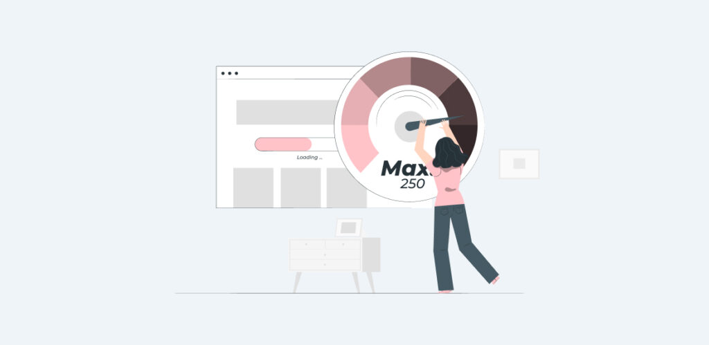
While it is a given that your webpage should load up ASAP. Most websites claim that the average page loading time should be between 1-3 seconds, Google says that the probability of your user bouncing increases by 32% if your page load time goes from 1-3 seconds. In other words, if your web pages aren’t loading up instantly, you risk losing long-term users. However, achieving optimal load time can often come as a challenge.
Here is a checklist that might prove helpful in ensuring that your page load time is minimized for the best user experience.
- Optimize Images: Make sure that any images you’re using on your website take the least size possible without compromising on quality. With optimized images, your page will load up with crisp visuals without making your site visitors wait any longer than their patience allows them.
- Minimize HTTP Requests: To elaborate a little, HTTP Requests are simply queries made by your browser to a website to send over data. This data arrives in small packets and is therefore dependent on the space your page occupies. In the simplest words, the more elements you have, the more HTTP requests, resulting in longer load times.
- Use Content Delivery Networks: CDNs are servers websites use to have their content and media promptly available across multiple geographic locations. The closer your CDN is to your users the faster your web pages load up.
- Enable Caching: With the help of caching, you allow your website visitors to store a copy of your webpage on their systems, allowing pages to load up faster whenever they return to your website.
- Minimize the Plugins in use: Make sure that your website is only using plugins that are absolutely necessary. The more plugins your website has, the more time it will take whenever they are loaded with your webpage.
- Choose a Fast Web Hosting Service: A fast web hosting will ensure that your data transfer becomes instantaneous. However, this isn’t the only benefit of getting awesome web hosting, as choosing a web hosting can often be quite a complex process. There is a blog on our website that might help you in selecting the best web hosting service.
Ensure an Effective Call-To-Action (CTA)
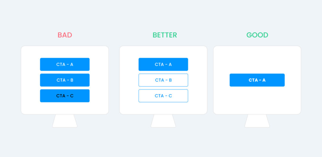
The reason behind your website is likely conversions. However, without an exceptional CTA encouraging users to convert, all your efforts could be for naught. The first step is to start with CTAs(yes, you can have multiple on a single page) making them clickable. Letting your users know where a button will take them is a vital tactic.
But that isn’t all, you have to ensure that your CTA is the right size, and easily decipherable from your informative copy. If your CTA is too small, then your user may not notice it, and if too large, your User Experience will be negatively impacted. A good way to highlight your CTAs is to use contrasting colors. We use Cyan, Fucshia, and White, and you can use a mix of your own brand colors, just make sure your CTA buttons stand out.
Another thing to keep in mind with CTAs is that the copy directing toward them is short and simple. What you need from your user with a Call-To-Action is literally action, so use fewer words and go for more impact. Also, keep in mind that your focus is to optimize the user journey, so your CTA should appear where your user would naturally look next.
Making sure that your content flows and directs your visitor to your CTA is essential if you want your user to do something without getting confused. Of course, then coupled with those points you need to make sure there is enough space for everything to make sense.
A good practice is to A/B test on these arrangements and analyze the impact of your different tests to see which formula works best. You can also use that information to fine-tune how your CTA appears to your user.
Have Clear, Well-Written Headings
When we talk about how to deliver an outstanding user experience, relevant creativity isn’t just appreciated but actually rewarded. If your Main Banner Copy resonates with your users, they will be hooked instantly. A good tagline or a catchy copy that defines your offering cleanly will always enhance user experience. Remember, your user should be intrigued, and motivated towards your solution or offering when they open your web pages.
The more enticed they are with your headings the more likely they are to read the following text.
Keep Your Linking On-Point
Whether your web page is pointing to an internal link or an external one, make sure that the link is working right. Those 404 errors can be a literal plague to User Experience and your website’s SEO, so the best practice is to be on the lookout and weed them out ASAP.
The reason why this is an often prevalent problem is because a single typo can lead to a 404 error. So a good practice is to check and recheck whenever you’re adding a new internal link to a webpage. In the case of outbound links (links leading to an external website), you can use an SEO tool like Ahrefs’ Site Explorer.
Bring Contentment with Content
For an optimal user experience, you’ll definitely need exceptional content. Make sure that the content on your web pages is appealing, relevant, and informative for your users. A good practice is to use simple language, using vocabulary that your audience can easily gauge and engage.
The idea is to keep your information as clear as possible. Make sure you’re not copywriting, but rather UX writing. Use your content to guide them through the journey of your website. Here are a few tips to help boost your UX writing:
- Wherever you’re using a hyperlink it should be easily discernible from other content.
- Make sure you use bullet points to segment and present key information.
- Let visuals and media on your page complement the content.
Always Ask For Feedback
Asking your users directly for feedback is always a great idea. With this feedback, you will know firsthand the problems your users may have faced while navigating your website. Moreover, their feedback will also tell you what factors about your website are excellent. Detailed feedback from a relevant user will always provide you with insights.
Conclusion
An outstanding user experience isn’t just essential for your users but also something Google emphasizes. Google officially has a set of metrics that solely focus on measuring user experience known as the Core Web Vitals. Moreover, Google has made changes to the core web vitals so that websites consistently achieves optimal user experience. You can check the report for them on how your website is doing UX-wise from Google Search Console.
Good luck for your website now that you know how to deliver an outstanding user experience for your website!


